Does Language Affect How We Perceive Colour?

Amazingly, our ability to recognise colour is influenced by the language we speak.
If that sounds ridiculous, then you might be interested in the results of a 2006 study into the Himba tribe from northern Namibia. [1]
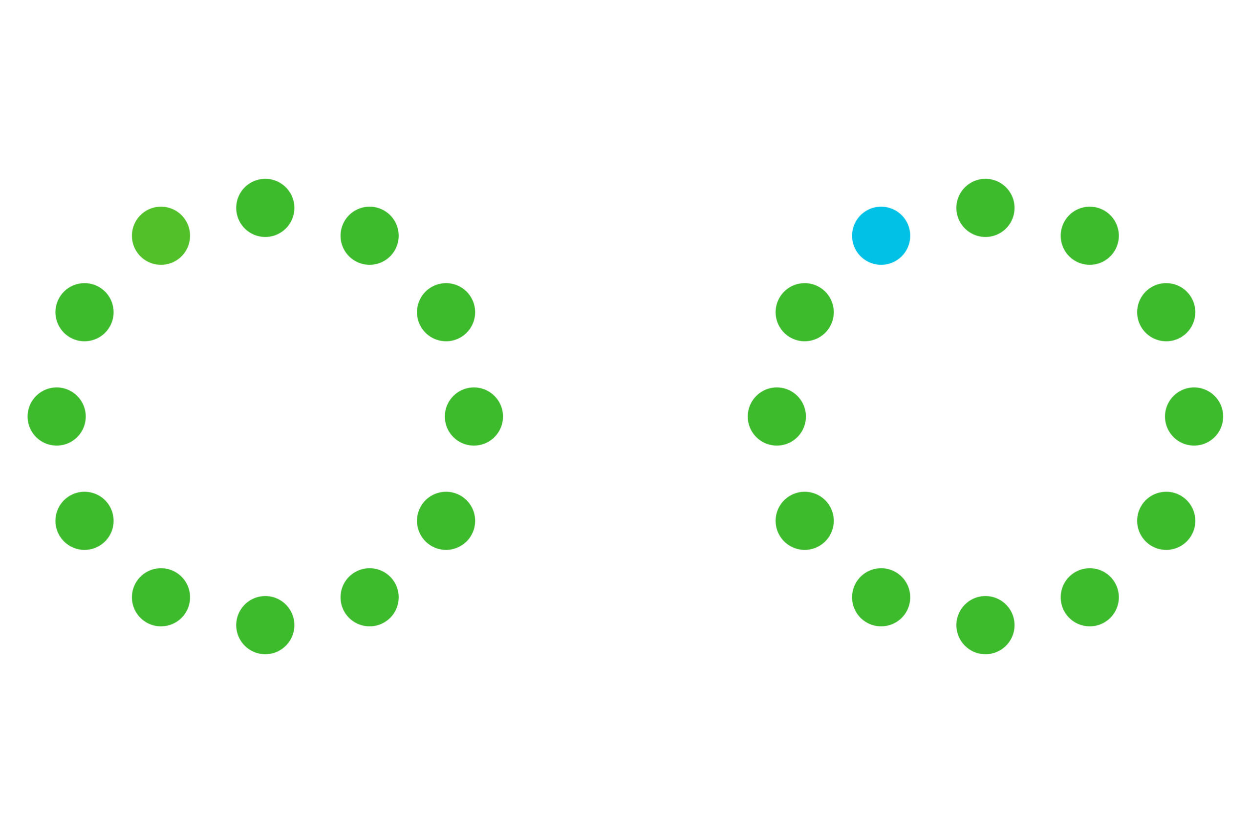
Two groups – one English, the other Himba – were first shown a circle of twelve green discs, where one was shaded a slightly different shade of green to the others. When asked, the Himba were quickly able to identify this disc, whereas the English speakers really struggled to do so.
Next, both groups were shown a circle of eleven green discs and one blue disc, and asked to identify the odd-one-out. This time the Himba struggled, taking a much longer time to answer than on the previous exercise. In contrast, the English speakers were easily able to identify the blue tile.
Look at the colour discs below and see how you fare (in case you are unsure, in the first circle the lighter-shaded green disc is at 11 o’clock, as is the blue disc in the second circle).

So, why does this difference in perception exist? Does language have anything to do with it?
English has eleven principal colour categories: black, white, grey, red, green, blue, yellow, pink, orange, purple and brown. Significantly, the Himba have only five: Serandu (which includes reds, browns, oranges and some yellows), Dambu (a variety of greens, reds, beiges and yellows), Zuzu (black and most dark colours), Vapa (some yellows and white) and Buru (different shades of green and blue).
The Himba struggled to identify the blue tile because they have no single word for blue. For them, it does not exist as a distinct colour category, but instead as a shade of green. No wonder they found it hard to differentiate.
Conversely, English speakers only have one colour category to describe shades of green, whereas the Himba have several. They are able to quickly identify the lighter green tile because they can better describe it.
In fact, colour categories vary between people and cultures all over the world. The Bambara people from the Congo have only three colour terms: Dyema (white, beige and naturals), Blema (reds and browns) and Fima (dark green, purple, black).
The Warlpiri people from Australia’s Northern Territory don’t even have a word for “colour”, instead referring to texture, physical sensation and functional purpose. [2]
Much closer to home, Greek, Russian and Turkish all have distinct words for light and dark blue. In Greek, ghalazio means light blue, and ble means dark blue. As a result, speakers of these languages are much more confident than their English counterparts in differentiating between intermediate shades of dark or light blue. Further reinforcing the link between language and perception, it was also found that after prolonged periods living among English speakers, native Greeks eventually stopped differentiating and came to see all shades as being simply blue. [3]
How do people and cultures decide on what colour categories to have as part of their language?
Initially, it was thought that cultures started naming the most salient colours first, adopting new categories chronologically. First would be black and white, or dark-cool and light-warm terms; then red; the third and fourth categories would be green and yellow; the fifth blue, sixth brown and seventh purple, pink, orange and grey. These basic colour terms would be adopted in sequence as the language evolved, meaning that if a certain basic colour term was found in a language, then all earlier colour stages should also be present. [4]
However, there are problems with this theory, one being that it does not reflect the haphazard explosion of colour in industrialised countries.
A more recent study of 110 languages found that colour categories are chosen for ease of communication. Surprisingly, when asked to name a broad range of colours, all participants in the study, across all 110 languages, found it easier to categorise warm colours like reds, oranges and yellows, than cool colours like blues or greens (more often with the cooler colours, participants were unable to decide into which category the colour should go).
Having established this rather extraordinary common thread, the next question was why?
Why do so many languages show a preference for the same colour category?
Computer analysis of thousands of images of human life provided the answer. From the analysis a pattern emerged, showing that the objects we see in front of us and that we use every day are more often a warm colour, and that our background and the landscape around us is more often a cool colour. Naturally, humans are more interested in describing the objects in front of them than the background around them, and so we favour warmer colours. In short, we label the things we want to talk about. [5]
There’s a scientific sounding name for all this: the Sapir-Whorf hypothesis; the hypothesis that the structure of a language influences its speaker’s cognition, and that people’s perceptions are relative to their language.
[1] Colour Categories and Category Acquisition In Himba and English, Roberson, Davidoff, Davies & Shapirowho.
[2] The Way You See Colour Depends on What Language You Speak, Casaponsa & Athanasopoulos
[3] Colour Perception: Objects, Constancy and Categories, Witzel & Gegenfurtner
[4] Basic Colour Terms, Berlin and Kay
[5] Colour Naming Across Languages Reflects Colour Use, Gibson, Futrell, Jara-Ettinger, Conway et al